To keep brand colors consistent across company merchandise, approve a physical reference for each material and decoration method—not just one logo file. A printed shirt, embroidered cap and coated bottle can share a brand palette without being identical surfaces. Specify the intended color, agree on the closest acceptable result, and preserve that decision for reorders.
The buying decision is how much matching your program actually needs. An everyday employee store may work beautifully with neutral products and a controlled logo palette. A coordinated launch kit photographed together may justify more sampling, fewer products or a batch production run. Neither requires pretending a screen preview guarantees the finished result.
Publisher perspective: Brand Sauce publishes this guide for company-store buyers. The workflow below is editorial guidance, not a claim that every supplier or Brand Sauce product supports custom color matching. Product, destination, method, minimums and pricing need written confirmation.
Start by defining what “consistent” means
Before asking a supplier to match your color, decide which of three outcomes you need. Otherwise marketing may expect a near-identical set while procurement has bought individually acceptable products.
| Goal | What you approve | Typical buying implication |
|---|---|---|
| Recognizable brand family | Approved logo colors on complementary product colors | Broader assortment; allow deliberate differences between materials |
| Coordinated set | Finished items viewed beside one another | Sample the complete set; replace a product that clashes |
| Controlled repeat production | Material-specific master sample and agreed acceptance method | Confirm production controls, reapproval triggers and any additional cost |
Write the goal into the brief. “These items will appear together in an executive welcome box” is more useful than “make everything our blue.” Also distinguish the base product color from the applied logo color. Approving blue thread does not approve a supplier’s stock blue jacket, and selecting a blue jacket does not establish the correct print color.
Why a Pantone number alone is not enough
Pantone distinguishes its graphics system from its Fashion, Home + Interiors system because materials and applications differ. Its guidance on translating color across materials explains that a graphics color does not necessarily have a direct textile equivalent. Treat the reference as the start of a production conversation, not proof of an exact match.
Keep the full reference, including its system and suffix. Pantone’s explanation of coated and uncoated guides notes that these identify appearance on different paper stocks; the same ink color can look different on those stocks. Dropping that distinction from a purchase brief removes information.
For each product, ask: “Are you using this reference to select an existing material, mix an ink, or approximate the appearance with your available process?” Those are different commitments. A named stock color such as navy or royal is not, by itself, a promise to match your brand reference.
Keep HEX or RGB values with the digital artwork, but do not make a laptop image the sole physical acceptance standard. The practical safeguard is a signed-off finished sample or agreed physical reference. If the supplier cannot work from your preferred standard, resolve the alternative before opening employee orders.
Build a material-by-material color record
A useful color record connects the design intent to the actual item being produced. It should travel with the order rather than live only in a designer’s inbox. Start with this template and remove fields that do not apply.
| Application | Record before approval | Question for the supplier |
|---|---|---|
| Printed apparel | Garment SKU and color, artwork version, print method, agreed color reference | What result can this method achieve on this exact garment? |
| Embroidery | Thread manufacturer, product line, color number, garment, approved stitch sample | Is this an exact listed match or the closest available thread? |
| Drinkware and hard goods | Base item and finish, decoration process, imprint color or approved uncolored treatment | Which colors are stock finishes, and which can actually be customized? |
| Printed packaging | Stock, finish, color reference and finished proof | Does this proof represent the material and finish being ordered? |
| Reorders | Prior approval ID, current supplier and any production changes | Is anything different from the approved specification? |
For embroidery, the distinction is especially concrete. Madeira’s Pantone color-match tool directs buyers to request the closest thread match when no exact match is specified. Its color-card range also separates thread types. Record the selected thread line and number, not simply “Pantone matched.”
This is not a reason to reject embroidery. It is a reason to approve what will actually be stitched. For the broader production decision, see our guide to embroidery versus printing for company apparel.
Approve the relationship between products, not just each item
Ask for samples of the combinations that matter most: the logo on its intended garment, the bottle beside the notebook, or the cap beside the polo. A sample on white fabric does not settle your approval of the same artwork on a dark garment. A blank bottle does not settle its finished imprint.
Use a compact review sequence:
- Confirm identity. Check SKU, product color, artwork version and decoration method against the brief.
- Compare with the reference. Put the physical standard beside the finished sample instead of switching between emailed photos.
- Review the actual set. Decide whether the items look intentionally coordinated, not whether their catalog color names agree.
- Check relevant lighting. Include the environment in which the set will normally be seen, and document the conditions used for approval.
- Record the decision. Approve, reject, or accept a named exception for this specific item and order.
The lighting check has a real technical basis. X-Rite explains metamerism: two materials can appear to match in one lighting condition and differ in another. A casual check in multiple rooms is a useful buyer screen, not a substitute for an agreed professional evaluation method when precise color control is essential.
Do not invent a universal pass/fail tolerance. For a tightly controlled program, ask the supplier which measurement method and viewing conditions it uses, whether it can support your requirements, and how disagreements will be resolved. For routine company-store merchandise, a documented visual approval may be the appropriate commercial agreement.
Our branded-apparel sample approval guide covers the wider fit, placement and construction review. Color approval is one part of that process; it should not silently stand in for approval of the whole product.
Choose a deliberate fallback when the match is poor
“Close enough” should be a brand decision, not an undocumented production workaround. Agree on a fallback order before sampling, so a disappointing result does not force a last-minute argument.
- Change the base color. A neutral garment can let the approved logo do the brand work without competing with a nearly matching fabric.
- Use an approved one-color logo. If your brand rules allow it, white or another approved neutral can be clearer than an inaccurate signature color.
- Change the decoration treatment. Ask what alternatives the exact item supports; do not assume every process is available.
- Change the product. Keep the use case but select a material or stock color that coordinates better.
- Reduce the assortment. A smaller approved group can be preferable to a large collection with visibly conflicting interpretations.
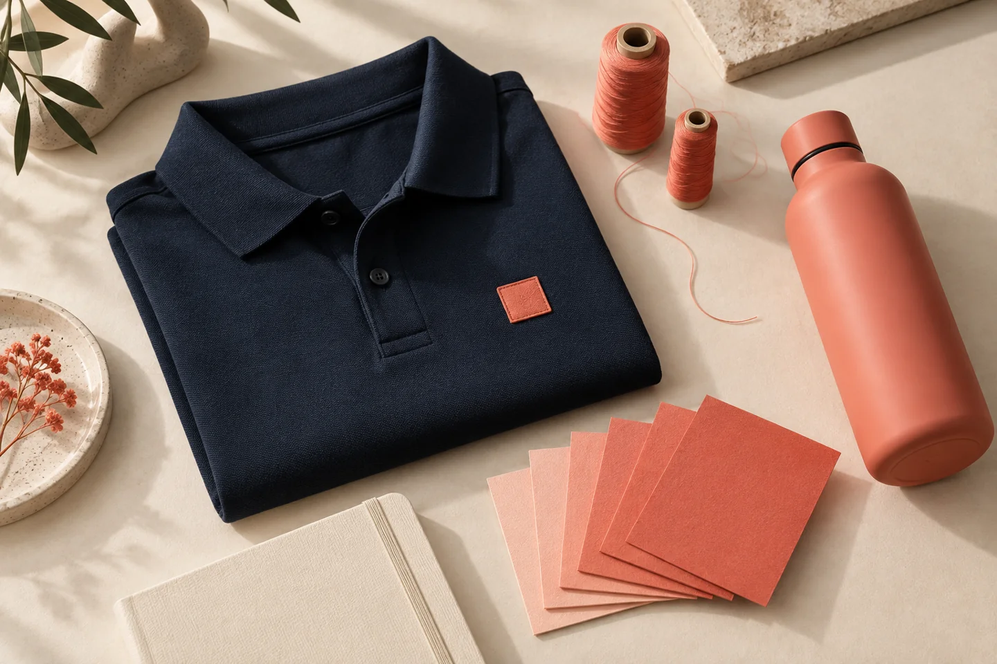
Illustrative scenario: a company wants a coral polo, coral bottle and coral notebook in one kit. The stock shades clash when placed together. Instead of commissioning custom production for every component, the team selects a navy polo with an approved coral decoration, a neutral notebook, and the bottle as the main coral element. That is a hypothetical design solution, not a client result or a claim about available Brand Sauce stock.
The key distinction is intentional contrast versus accidental mismatch. Your color record should show which one you approved.
When bulk, on-demand or hybrid makes sense
On-demand production is useful when people order at different times and you do not want to pre-buy decorated stock. It does not remove the need for color approval. Ask how the supplier maintains the approved specification across repeat orders, locations and any substituted blanks. If it cannot confirm the same item or process, treat that as a change requiring review.
Bulk production can be the better fit when a defined group needs coordinated items together and the supplier can offer the required production control. Ask whether the order will actually run as one batch, what can vary within it, and whether holding reserve stock is worthwhile. A large order alone is not a color guarantee; it also commits money to quantities and sizes before all demand is known.
A hybrid can separate the jobs: batch-produce a tightly coordinated event collection while keeping an everyday store stocked with approved neutral bases and simpler decoration. Compare sample costs, setup charges, minimums, storage, reorder conditions and delivery requirements. All supplier-specific pricing is quote-needed; there is no defensible blanket claim that one model is cheaper.
For the wider inventory and fulfillment tradeoff, use our on-demand versus bulk decision guide. The color requirement should inform that choice, not be discovered after the production model is locked.
Keep reorders from becoming new interpretations
Give each approved combination an ID. Keep the artwork file, physical sample location, item specification, approval date and approver together. Retain a reference sample out of ordinary use so a worn employee shirt does not become the only benchmark.
Request reapproval when the blank SKU or color, thread line, decoration method, production facility or other agreed color-critical input changes. Ask the supplier to identify changes before release. A previous approval should not automatically cover a replacement product just because both are called navy.
Separate two types of exception. A one-order concession allows a named deviation for a particular batch. A specification change updates the standard for future orders. Without that distinction, a temporary compromise can quietly become the permanent definition of your brand color.
Copy this color-control brief into your next request
- Our goal is: recognizable brand family, coordinated set, or controlled repeat production.
- These items will be used or displayed together: [list].
- The full brand reference and approved alternative artwork are attached.
- Please identify the proposed SKU, stock color, finish and decoration process for each item.
- State whether each proposed match is exact to a supported standard, a closest available option, or subject to physical approval.
- Quote samples, setup, minimums and any special matching work separately.
- Do not substitute color-critical inputs without written approval.
- Confirm the approval reference, acceptance procedure and remedy process before production.
Frequently asked questions
Can every item match our Pantone color exactly?
Do not assume so. Availability depends on the material, existing stock colors, production process and supplier. Request the supported match and a finished sample; a color reference alone is not a capability guarantee.
Is a digital proof enough to approve color?
Use it to review artwork and the supplier’s proposed treatment. For color-critical work, also agree on a physical reference and finished sample. Make clear which aspects each proof approves.
Should we reject every small difference?
No. Decide what matters in context. An intentional coordinated palette can be acceptable even when materials are not identical. Reject or approve against the agreed requirement, not a new expectation introduced after delivery.
Who should own the final decision?
Name one brand approver and one purchasing owner. The brand approver accepts appearance and exceptions; purchasing records what was approved and confirms the supplier’s written scope. Keep both decisions attached to the order.
Primary sources checked September 28, 2026. The hero is a custom conceptual illustration, not a photograph of available products or evidence of a measured color match.